6 Web Design Ideas and Tips for Restaurants.
Creating awesome web design for your restaurant is a complicated business. Happily, we’ve done it loads, and we’re here to help! We’re Walnut Wasp, a Scottish web design agency, and we’ve worked with clients throughout Glasgow, Edinburgh, Dundee and the rest of the UK, to create awesome restaurant and hospitality websites. And we’ve made you this handy guide to creating epic web design for your restaurant, bar or hospitality business. Let’s get into it!
1. make an accurate and specific first impression about your restaurant
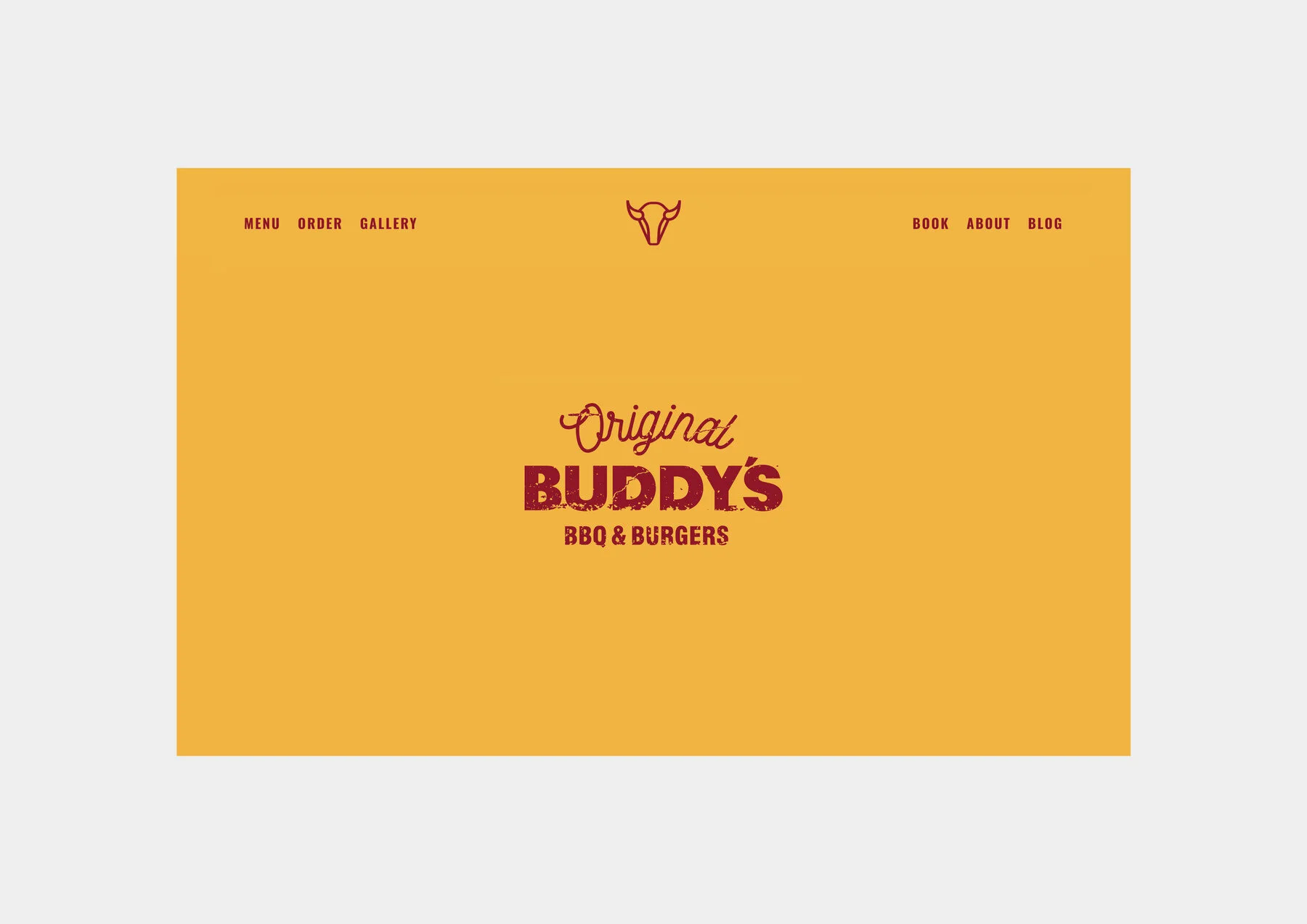
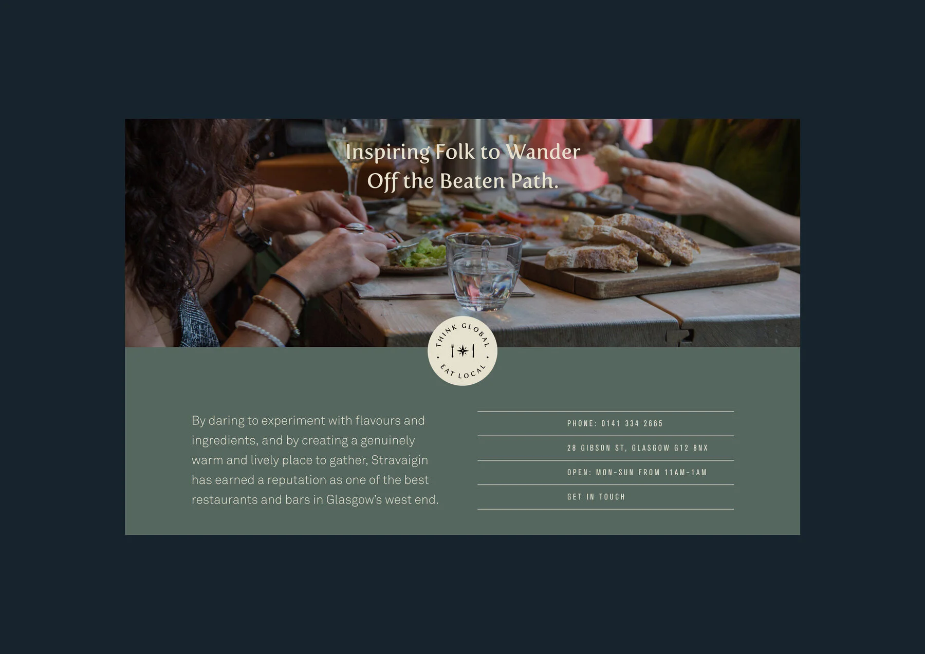
There’s a tremendous amount of choice available to customers looking for a restaurant, so be specific about what you do really well, and why it should be you that customers dine with, as succinctly and quickly as possible. This would be a prominent line of written copy: it could be something that’s totally direct and on the nose, like in the example of Buddy’s BBQ - or it can be something that’s more conceptual and captures the spirit or character of the dining experience, in the case of Stravaigin. But either way, give us something that’s true to the spirit of what we should expect if we choose your place.
“Original Buddy’s BBQ & Burgers” instantly giving a very clear sense of what the offering is; reinforcing authenticity with “Original”.
Stravaigin - a conceptual approach, with “think global, eat local” and “inspiring folk to wander off the beaten path” both reflecting their eclectic, international menu, and both very near the top of the site.
2. make sure your website layout serves both new and returning customers
Some customers who arrive at your website have no idea who you are or what you do - and of course you want to make the best possible impression on them. Others have been many times, and just want to find the relevant information as quickly and easily as possible. Great web design for restaurants should thread this needle, by ensuring that you take every opportunity to show your unique qualities, but also signpost your menu, your booking system, your opening hours and your address quickly and easily.
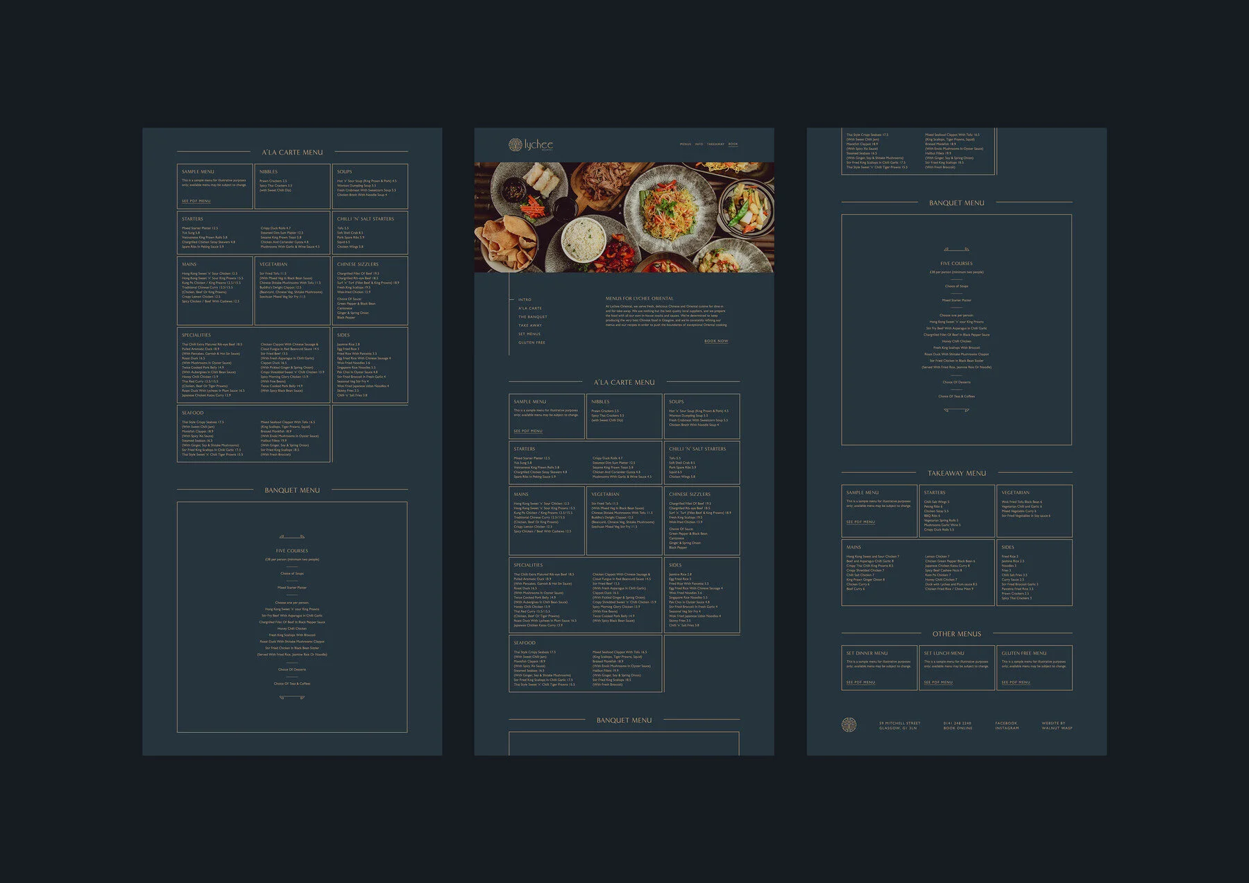
It’s always good to give people the ability to do the key things - view menu; book a table - within (maximum!) one direct click on the homepage, and it’s also good to put them in predictable and easily accessible places. In the example below (Lychee Oriental), we used a simple, very clean format of boxed-in structured information to keep absolutely all essential information very easily found:
On the Buddy’s BBQ website, each page featured identical structured information so that customers can’t miss the opening hours, the address, and the phone number no matter where they are:
3. great photography (and video!) is the lifeblood of any restaurant website
We’re a sucker for great food imagery - check out our food photography portfolio here, and our food video portfolio here! - but biases aside, there’s no denying that showing your food in the best possible light is the next best thing to people getting to actually taste it. This applies to all restaurants, but the more luxury/high end the service, the truer it becomes: your food has to look awesome on your website, because if your food is great in reality, but your website only makes it look okay, then your website is really underselling your offering. Which is kind of the exact opposite of the job of your website.
There are many ways to work great imagery into your website. As a full service agency, we think it’s great to design a website with the imagery in mind directly. That’s exactly what we did for the Ubiquitous Chip website, shown below - we knew that we were going to shoot extensive video content for the restaurant, so we designed pages around static video shots that incorporated movement in a cinemagraph-style format. But it’s also worth taking inventory of all video and photography assets that you have, even when they’ve not been commissioned specifically for the site design. You’ll want to feature great hero shots of your dishes, as well as your decor, your location, and maybe even your staff; you’re trying to give people every reason to have confidence and to make a booking, and people respond to different things, so mix it up - and make sure to play to your strengths. Got awesome decor, or beautiful dishes, or fancy cocktails, or a handsome KP? Show us, with photos and video!
Hit play to see how static video, shot with the site structure in mind, can be used to really impactful effect, as it was on the Ubiquitous Chip website:
4. your web design should be an extension of your physical location and your brand personality
The close attention that you pay to the design and the vibe of your physical space? That’s the same level of attention that you should pay to the look and feel of your website. You want the site to truly feel like an extension of the best parts of the physical location; just like the food photography, this is your prospective new customer’s best chance to really experience your restaurant before they commit to spending their hard-earned cash. So take the opportunity!
Stravaigin is absolutely chock-full of character and history, and it was essential that we incorporate their totally unique and subversive charm in their website experience. Their eclectic decor and artwork turned out to be a key asset for us - we incorporated colour-treated versions of some of the wall art in various textures throughout the website, to try and capture the spirit of the venue.
Meanwhile, Kitschnbake is a great example of a family-owned establishment buzzing with humour and fun. We distilled that as best we could into an organic, colourful and youthful brand, and made sure to make full use of those branding elements - including loads of fun bespoke illustrations - throughout their website (combined with colourful and indulgent food photography for impact). In both cases (Stravaigin and Kitschnbake), you get a very clear sense of the personality of the business and the location, based on the aesthetic choices made.
5. show me menus on the site; don’t make me download PDFs if possible
Nothing’s absolute, but for the most part, it’s good practice to show at least the key menus right there on the page, instead of making users download a PDF. There’s a few great reasons to do it this way. Firstly, many users are browsing on mobile, and therefore making them download PDFs to their devices is annoying - it clogs up their device, and the PDF itself is going to launch in some app that you can’t control. So it might not be formatted very well for mobile, etc. And also, you’re actually missing out on some modest SEO advantage if you don’t put the actual text on the page. By listing your dishes, you’re giving Google information about exactly what you sell - it’s probably not going to move the needle much unless you’re selling some fairly unusual and niche items which also happen to have heavy search traffic in your locality, but every little helps.
However, the main reason to publish the menu in full on the site ultimately comes back to usability. If I’ve already clicked the Menu option in your navigation, then reward my click by showing me the key menus. Don’t make me click again if it can be avoided - I’m perfectly happy to scroll. However, there are no hard and fast rules of course, and some situations will suit bespoke solutions. Lychee Oriental has several long and complex menus, and so we opted to put the key menus live on the site, and we presented some of the more niche menus (like gluten free) as PDF downloads, to shorten the length of the page and to reduce overall complexity.
6. keep your restaurant website up to date
Please, keep your website up to date. It’s like your online shop window - it’s where your customers are going for information about your business. They’ve done the hard work of visiting your site, so you just have to give them the relevant info. This has always been a bugbear of mine personally, but it’s been made far worse living through the COVID19 pandemic, where my frustration at establishments failing to keep their websites up to date was at an all-time high. Customers want to know that it’s either business as usual, or that you’ve got new practices in effect. So - if they have some reason to doubt that it’s business as usual - as we repeatedly saw during COVID19 with various shutdowns and restrictions - then give them clear guidance right away so they know what to expect.
Walnut Wasp is (among other things!) a boutique web design agency based in Glasgow, Scotland that specialises in food and beverage clients.
If you’re interested in working together?


