Differentiating your brand, part one.
Here’s some quick thoughts, using real-world client examples of ours, that will hopefully inspire some creative thinking if you’re reviewing or creating your brand. Everything about your brand - from the name to the logo to the design elements and colour schemes - should be thought of as an opportunity to reflect one or more of your key differential strengths. Here’s a look at how we designed brand assets to reflect the character - and the USPs - of three Scottish businesses.
Walnut Wasp is a creative design agency in Glasgow, Scotland, specialising in differential marketing for food and beverage and the wedding sector.
01. Harper Scott Photo
Harper Scott Photo is a Perthshire-based photography business run by Carole-Ann Scott. Carole-Ann shoots awesome, honest journalistic photography, and loves to shoot adventurous weddings and candid family portraits. We worked with her on a long-term project to revisit her brand and to try to distill those elements in all of her collateral.
- Branding and Collateral -
Carole-Ann's photography draws on a rich, cool palette full of deep blues and greens. It's rooted in nature, returning again and again to the epic landscapes of Scotland. It makes use of simplistic geometric framing. So we wanted to try and capture some sense of that in the brand elements. For that reason, we looked at trying to incorporate simplistic Scandinavian-inspired illustration and typography, as seen above - the rationale being that this style of design would invoke the bold simplicity and economy of the photography, and also give a nod to the epic Nordic landscape which shares so many characteristics with the parts of Scotland that Harper Scott frequently shoots.
We shared a Pinterest board with a client and collaborated on a mood board of brand inspiration, pulling from loads of sources, an excerpt of which is seen below.
- Design Inspiration (via Pinterest) -
We developed an alternative concept (seen below), drawing from the same themes on the same mood board. Our intention with this discarded concept was to incorporate a mountain design in a novel and interesting way. Currently the concept of a Scottish photographer logo that's centred around a mountain motif is moving into overdone territory; we were aiming for something that incorporated that same imagery but with a completely different treatment, to put Carole-Ann's love of the outdoors and propensity for epic landscape imagery front and centre.
- Alternative Concepts -
The take-home:
Your brand is a platform that should reflect your key differential qualities. Find a way for the design to really distill those qualities, however subtly, so that each element adds to your story. Does Harper Scott Photo get more bookings because her brand reflects some Scandinavian influences, or because it mirrors the colour schemes in her work? You probably think that's a simple no, but actually - she gets more bookings because her brand is cohesive and works efficiently, with each element conveying her differential strengths and speaking exactly to the clients that she wants to book. And she gets more bookings because that unity reflects well on her own aesthetic standards, which are a completely fundamental aspect of photography. So - aye. She does.
02. The Neatly Wrapped Aromatics Co.
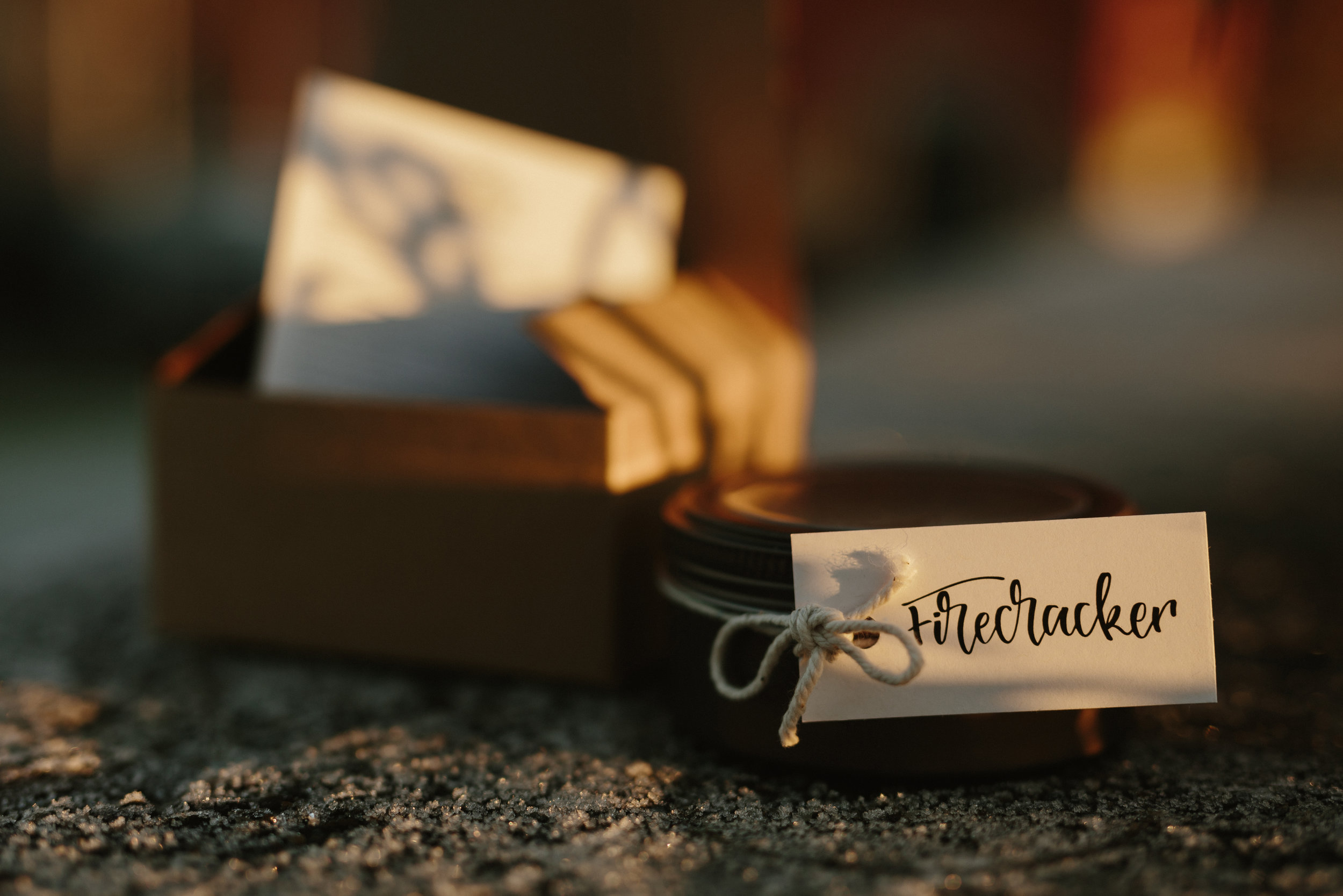
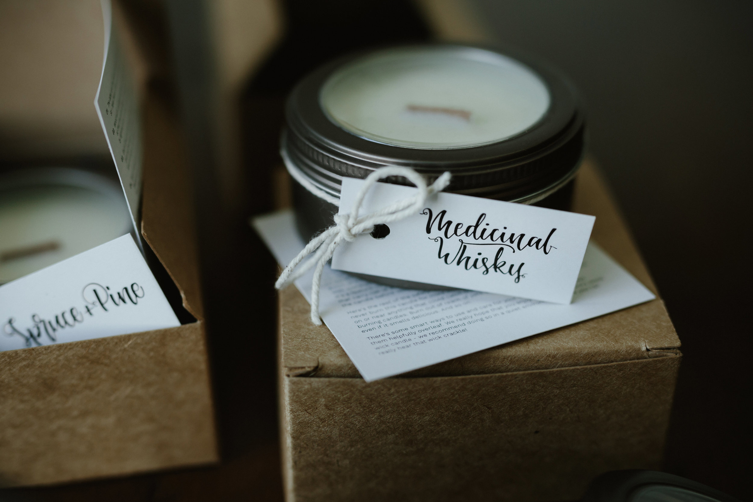
Neatly Wrapped Co. is a home-made candle company based in Glasgow, that creates bespoke fragrances, pours them into soy wax candles and sends them out with lovely crackling wooden wicks on them. For the name, we knew that we wanted to reflect the highly bespoke and hand-made nature of the business. We also really wanted to get across the fact that, with these products, the aesthetic presentation and the packaging was of paramount importance.
- Branding -
So the name The Neatly Wrapped Aromatics Co. - and the shorthand Neatly Wrapped Co. - is designed to reflect the hand-poured manufacturing process, and the strong visual attention to detail that are both crucial to the appeal of the brand. That’s continued in the actual logo concept - a really clean sans serif typeface with a hint of flair, the lines of text built into a little rectangular package, with a simple bow on top.
- Packaging -
Another key differential quality for the business is the use of sustainable soy wax. It seemed aesthetically and ethically very fitting to use completely recycled materials to package the finished candles, and it gives the product a nice lo-fi feel. Illustrated lettering was commissioned from the exceptionally talented Daisy Bisley to complete the look, which perfectly mirrors the concept for the brand (and the name) given that it's both hand-drawn and aesthetically pleasing.
- Illustrative Lettering -
- Design Inspiration (via Pinterest) -
The take-home:
Neatly Wrapped's aesthetic attention to detail, and the fact that the products are hand-made, are both absolutely crucial differential factors for this business - so they're baked right into everything from the name to the logo to the packaging.
03. Papamacs Gourmet Kitchen
Our marketing work for Papamacs Gourmet Kitchen, an excellent restaurant in Johnstone, Renfrewshire, has been some of the most rewarding - and delicious - that we’ve done to date. Key to the brand is the strong sense of family heritage - it's a proud, independent family business who are exceptionally passionate about their food. We’ve worked really closely with the restaurant to develop everything from new branding and interior decor, to an ongoing social campaign over the last 18 months which has transformed their perception and their footfall in the local area.
- Branding -
It was key to emphasise two areas of Papamacs from the brand upwards - their passionate love of food, and the fact that it's an independent family business. This branding is designed to invoke a strong sense of family heritage across its various iterations. The crest feel of some of the circular iterations implies a family pride that comes with that history. The use of various stamped or imprinted features – the bold shadowed typeface on Papamacs, the repeated pattern textures (as seen underleaf above), the circular stamp logo – invoke an era of self-branded, bespoke produce that pre-dates affordable printing, when small family-owned businesses would ship products that are stamped personally.
The brand launch for Papamacs extended to some interior renovations, for which we were helped greatly by Betty Bluebell and Maverick Designs. Notably this includes a themed gallery wall full of images of family, often with food and/or drink.
- Interior Design -
We developed an alternative concept as seen below, which also builds on this theme. Once again the typography is vintage-inspired,this time invoking prohibition-era American family-owned diners, a good match for the exposed brickwork and clipboard menus of Papamacs.
- Alternative Branding Concept -
The take-home:
With Papamacs, we had to re-educate the local community that this was a restaurant, and not a deli, or a bistro or a bakery or a coffee-house. A change to the name, supplemented by loads of mouth-watering food photography and a big visual overhaul, has really helped to hammer that message home; if those elements weren’t changed then the significant social media investment over the last 18 months would have been inefficient, as that brand is the cornerstone for everything else.
You can see a deep dive on our transformation of Papamacs, including lots of detail about the interior overhaul, the social media campaigns used and much more, here.
We're running a marketing workshop for wedding suppliers in Glasgow, on Tuesday 21st February. You can read details and book on here while places remain.


